Antialiasing is a technique used to add greater realism to a digital image, or in our case, a cross stitch pattern, by smoothing jagged edges on curved lines and diagonals. This is done by by adding intermediate colors. For example, suppose you create a simple pattern of a black circle on white.
If you just use black and white, the pattern will look like this:
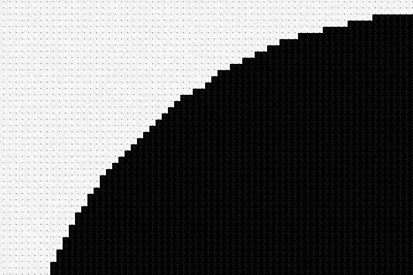
Antialiasing adds shades of gray to smooth out the jaggies. Now the pattern will look like this:

Much nicer!
Now when we are creating a pattern like this, we create it with a white background so that we get the antialiasing stitches, but then we take out all the white stitches, making them unstitched on the chart. You’ll stitch light to dark gray stitches around the black area and it will make the black transition smoothly into the white fabric. The pattern description will say “Background is not stitched. White fabric recommended.”
What happens if you don’t use white fabric? Suppose you had some gray fabric around, and decided to use it instead. Now the lightest stitches, that are supposed to fade nicely into the white fabric, stick out, like this:
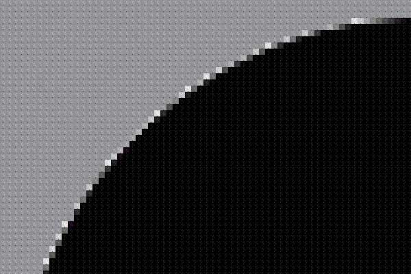
Not the end of the world, but not what was intended either.
A more likely case — what if you buy a pattern that we say was designed to be stitched on black, but you don’t want to stitch on black? (We know stitching is harder on black fabric but if the original background in the picture was black or dark, we might design the pattern that way — the version of Girl With a Pearl Earring where the background is not stitched, for example.) Here’s what a pattern of a medium gray circle designed to be stitched on black fabric might look like:
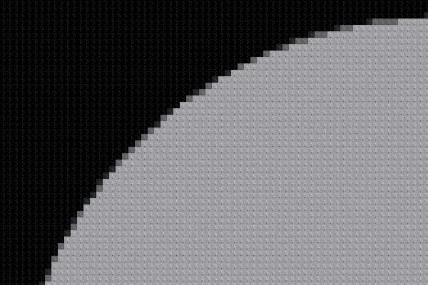
Notice that the antialiasing stitches are intermediate in color between the object and the fabric as before, but this time they’re darker shades of gray. Now, what if you stitch this on white fabric? It will look like this (and yes, these two pictures are identical except for the color of the background. Your perception of color is greatly affected by what it’s next to):
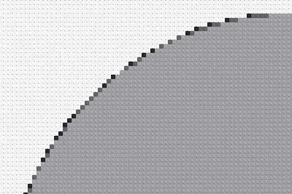
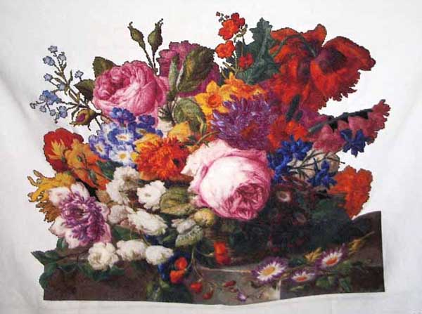
You might think that the dark border is kind of striking. Here’s a picture from the gallery of Corbeille de Fleurs – Joseph Nigg. This was the version of the pattern designed to be stitched on black, but the stitcher used white instead. We think it looks pretty good! You can see the dark border particularly around the yellow flowers on the left, but mostly it just makes the darker colors really pop.
If we start with an image that appears to be only two colors, such as Brer Rabbit – William Morris, antialiasing can increase the number of colors used in a confusing way. Here is the way the top left corner of Brer Rabbit looks in the fixed scale (larger) view:
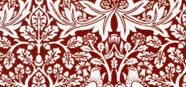
It looks like it’s two colors, but the pattern description says there are 28 colors. So people either say “I would like to do the two-color version” or they say “Where is the picture of the 28-color version?” Here is a greatly enlarged piece of the apparently two-color, actually 28-color pattern:
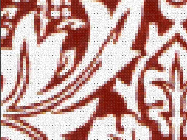
All those extra colors smooth out the curves and make it look like the original print. (BTW, this kind of fabric print is made by starting with red fabric and then bleaching areas to make the design. So in the original, the red is the background, but we thought it would be more fun to stitch red on white fabric (plus white fabric is readily available and the exact shade of red is not). The pattern description does state that the white areas are not stitched, and this doesn’t seem to be a point of confusion.)
There are other two color patterns, notably Souls being Received into the Heavenly Paradise – Edward Burne-Jones, which uses 23 colors, but apparently people expect a black and white picture to have some gray, and no one has ever asked about it. It seems to be more of a leap to think that a red and white picture should have some pink.
OK, I’m rambling now.


From Nancy Garcia
4 years, 1 month agoScarlet Quince, you are amazing! All of this makes perfect sense, but I never would have figured out how to do this! Thank you for your eye for detail and passion to make these beautiful works of cross stitch so authentic!
From Don Doling
4 years, 1 month agoI was wondering how important the colors of the periphery are. Thank you for the answer. Don