I just got finished updating the map, which necessitated figuring out how I created it in the first place. This has been on my to-do list for a long time but I was spurred on to get it done by a request from one of my wholesale customers. She sold a chart to someone who lives in Baker Lake, Nunavut, who was very anxious to have his own X on the map. Although the map really reflects the locations I’ve sold to directly, I was happy to fake up something for someone living in such an out-of-the-way place.
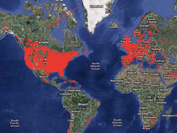
Have you ever heard of Nunavut? If so, you must be Canadian (or better at geography than I am). It turns out that it was only separated from the Northwest Territories (which I have heard of) in 1999, so I have a little bit of an excuse.
My main excuse for being so ignorant of geography is that I was in grade school during the cold war and what we had was military-industrial geography. Our textbook took the same approach to each country we studied: first, how many square miles it was. Then, since they realized that didn’t convey much, they would superimpose an outline of the country on an outline of whatever part of the US it was closest in size to. This was supposed to make it fun. But knowing that Remotistan is about the same size as Nebraska also doesn’t convey anything (except maybe a veiled suggestion that Remotistan sure doesn’t amount to much; countries that got compared to Rhode Island were obviously ridiculous). They would tell us what language or languages were spoken there — if it wasn’t English, there was an implication that the residents had got it wrong. We covered the form of government they had: democracy (correct) or other (incorrect). Then they would get down to a list of the products considered useful to the US. This always seemed to be grains and metals and minerals, no finished goods. The implication seemed to be that yes, the country might make precision-engineered cars or fine linens or fancy chocolates, but whatever they made, we could do it better. Sometimes they had a picture of apple-cheeked children in funny clothes, but that was about IT. I suppose we were shown where the country fit on the world map, but if you haven’t absorbed the location of country A, learning that country B is just to the east of it doesn’t help. (You can’t explain what chicken-fried steak is to someone who doesn’t know what chicken-fried chicken is.) It was really quite ugly and in a way I’m glad I didn’t learn anything. I certainly hope that geography is no longer being taught that way. But bit by bit, I’m filling in the gaps, and I’m glad to know where Nunavut is!
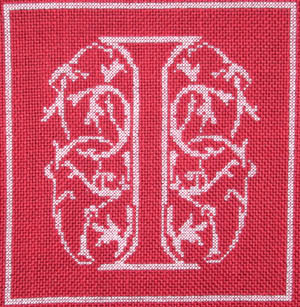
 I decided to do it in harganger. I have stitched hardanger before, following a pattern in a leafletI had, but I have never tried to design hardanger. It’s kind of mind-blowing because the basic units (Kloster blocks) are 5 stitches wide with each stitch covering 4 threads (which is 5 holes), and you arrange them corner to corner so you get squares. The pattern I worked before had each stitch laboriously drawn on graph paper showing exactly where each thread goes. I tried to do that but kept messing up. Finally I decided it would be better not to think too hard about it. I started by designing simple letters in a grid 6 x 5. Here’s my A.
 The “pixels” in the letters are going to be the open places after cutting threads, so I moved them apart to allow for the stitching around them:
 Then I sketched in my Kloster blocks around them. (Represented by the red lines — just pretend there are 5 instead of 2.)
 The remaining spaces between the places that will be cut out have to be needleweaving, indicated by 8’s. If you haven’t done hardanger, trust me: they just do.
 I decided I wanted a little more embellishment and was thinking of putting another row of kloster blocks all around, but decided that would look stupid and might not even work. Instead, I substituted a border of double wave stitch. This also made the letters bigger since so far the design is really pretty small.
 I planned to do this on some of the Ariosa Fine that is left from my redwork alphabet, since it’s 22-count. (My hardanger booklets recommend 22-count fabric with #5 and #8 pearl cotton.) The thing I forgot, though, is that it has a rayon content, which means that the cut ends get kind of fuzzy. 100% cotton or linen would be much better. I played around a bit with colors for the stitching but there aren’t too many colors that come in both sizes of thread, so I settled on red for the Kloster blocks (#5) and needleweaving (#8), and gold (#5) for the outline. Once I had made that decision, I thought gold beads would be a nice addition. I ad libbed them but here is my basic approach to the bead placement (dots on the diagram).
 Here is the finished letter A. I backed it with gold tissue lame. (I took a finished letter to the fabric store and tried different backings. I had thought about black, but liked this better.)
 MRA kindly cut squares from mat board which is very hard and stiff and he got them all the same size, which I wouldn’t probably have managed. I glued the letters to the squares and also turned the corners in and glued them. I bought some special fabric glue while I was buying fabric — it was supposed to dry clear — alas, not so. (The red square isn’t centered on the mat board because despite much counting and measuring, the letters never came out really centered in the fabric squares I had marked.)


 (I wish I could get a picture without the glaring red irises but you can see that Little Pearl has blue eyes — she’s a beautiful kitten.)


 I forced myself to finish the letter I before starting another letter just to see how long it took to do this relatively small letter. It took 13 days, but that’s elapsed time, not stitching time. There was a jigsaw puzzle in there, and not much else happens when I’m working a jigsaw puzzle. (This was a Christmas tradition in my family, which I have allowed to bleed over into New Year’s. I think this is the first year I’ve had one at Thanksgiving. It’s a slippery slope. Next it will be Columbus Day, then Labor Day, Flag Day, Arbor Day…)