Cross Stitch Patterns from Fine Art by Scarlet Quince
 Cart 
 Wish list
     |     
     |     
Check out
     |     
     |     
Wholesale log in
Member services
Scarlet Quince
Goodies
Ramblings

Scarlet Quince Ramblings

Cross stitch ... art ... life

September 12th, 2008

I’m waiting eagerly to see if Hurricane Ike will come through here. Originally Ike was predicted to turn south after it hit the Texas coast, then predicted to come straight through Austin, and now it’s predicted to veer sharply northeast. We aren’t even certain to get any rain, let alone any “interesting” weather. I hope they’re just wrong about that — why should it make a sharp right like that? It has gradually been clouding up today as the storm approaches and we may get some rain from the edges of the storm even if the main storm goes elsewhere. Rain just does a better job than sprinklers, so I’m hoping for a good steady rain — I can pass on roof-destroying hail and tornadoes. (We’ve been watering all summer and a lot of stuff was half dead until we had a couple of inches over a few days about a month ago. Then all the flowers went “Zowie!” and burst into bloom again.) We’re at the top of a hill so it can rain all it likes, as far as I’m concerned.

I understand the National Weather Service is telling people around Galveston that if they stay, they “face certain death”, and yet some people figure they’ll ride it out. I think the NWS made a mistake throwing down the gauntlet that way. Texas has a lot of pretty ornery people. They should have said that Ike has the power to confer zombie-hood, and anyone who doesn’t want to spend eternity eating brains should evacuate.

Along the highway, signs on the northbound side direct refugees, and on the southbound side, warn us not to go to Houston. Usually that’s just common sense — I normally avoid Houston at all costs, but seeing that sign did make me think it would be interesting to go to Houston and see some weather. No, I’m not going to — like I have time anyway.


September 7th, 2008

I’ve finished the top row of blocks in the blackwork (redwork? whitework?) ABC. ABC progress
I apologize for the mediocre picture but as usual, I took the pictures, moved them to the computer, and looked at them later to discover that the focus could be better. I would have started over but unfortunately I left the camera on so the batteries are dead (the camera shuts off automatically but apparently not when it’s connected to the computer). AND although I have 4 or 5 battery chargers and several sets of batteries, some of which I think don’t work, I can’t even find most of them right now. I probably just need to start completely over with new batteries and chargers. I think one charger got zapped and has destroyed whatever batteries I put into it subsequently. Some of them seem to charge in other chargers (at least the lights eventually go from green to red) but they don’t work in the camera. Anyway — if I ever get some more batteries charged I’ll try for a better picture.

Here’s a detail of some of the topstitching.
Topstitching detail

Mansard Roof
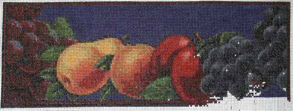
I am tempted to put this aside and start working on another Scarlet Quince for a while, but I can’t decide what I want to work on next. I’m leaning toward Hopper’s Mansard Roof at the moment.

Splendid I was also thinking about “Splendid”

or “Still Life with Fruit and Pocket Knife” but I feel like I have done enough fruit or a while. So temporarily I’m racing ahead to the letter D while I try to make up my mind. I know some people have a good system of rotating from one project to another but I suspect if I start something else, I’ll finish it before I come back to this — so maybe I should just finish this!


August 29th, 2008

I finally finished the pattern of Edward Hopper’s Gas yesterday. Gas - Edward Hopper I have been working on it for several days and not getting very far. It turned out to be much more difficult than I thought it would be to create a pattern from it. Usually, it’s the pictures of people that are the hardest — getting the skin tones right and arriving at a reasonable compromise between pattern size and detail.

I kept going back and forth between two images — one had an obvious diagonal pattern from halftones in the original print, and the other, while I liked the colors better, was very “pixellated”. But the main problem was adjusting the colors to a palette that could be matched in DMC floss, was attactive, seemed realistic, and had the right feel. When I started doing this, six years ago, I usually left colors pretty much alone. But I eventually realized that a lot of paintings are very dirty, or the varnish has yellowed or fogged, or even that the scan distorted the colors, so now I take a freer hand with color. I confess to a preference for bright, strong color and finally arrived at a version of the pattern that had clear, bright colors. Only then did I realize that it no longer looked like dusk — it looked like the middle of the day and the light from the little building made no sense.

The dim, dull colors (which aren’t as pretty) are the very thing that makes it look like dusk. I suppose this is because of the way our eyes work — the cones, which detect colors, are not very sensitive to light (so they need a lot of light to work). The rods are much more sensitive to light but they don’t detect color, so we can see in the dark but as it gets dark colors fade to monochrome. This is really quite an amazing picture on a technical level. The only really bright spots are the red gas pumps which are lit up by the light from the building. Although the sky is blue, the dim greens of the pines and the dull red of the roof (which would probably be bright red at noon) convince us that it’s twilight.


August 28th, 2008

This is Jemima, who helps out sometimes in the mornings. She comes in quietly (I usually don’t even notice) and gets into the chair. Her contribution is to sleep. She has only been doing this recently, since I hung a smock across the back of the chair instead of putting it away. I guess the chair wasn’t cozy enough before.
Jemima
This is much more help than I typically get from the other two cats. Topsy likes to walk on the printer and push the button to print a test page, or to sit on top of the monitor and trail her tail across the screen. (Monitor-sitting is mostly a winter activity.) Lucky also likes to sit on the monitor and if he finds Topsy there, he pokes her until she goes away. This usually entails a lot of screeching and swatting. It makes it easy to work. If it’s really cold, he gets into my chair behind me and begins pushing me with his back feet until I am sitting on the edge of the chair.

Jemima only has a short tail, and she can’t move it much. Usually it sticks straight out behind her, and when she runs, it flaps up and down which is cuter than you can possibly imagine. She probably doesn’t run that much faster than the other cats (if at all) but it makes it look like she’s really going hell for leather. We found her as a stray when she was about 6 months old so we don’t know why her tail is like that — she may have been born that way, or she may have had an accident. She’s still on the wild side. She doesn’t like to be fooled with but she has gotten so she likes to be near her people, which is very nice. One of the perks of working from home!


August 20th, 2008

We finally got rain yesterday and last night. I don’t think we have had any significant precipitation here in about 3 months. Edouard was headed straight for us, then broke up into little stormlets when it crossed the Balcones Escarpment (that happens a lot) and we got just a tiny amount of rain. One day MRA called in a panic to make sure the cats were in because it was raining hard (and he knows how oblivious I can be). It was raining three miles away, but here it didn’t even cloud up. We’ve had several cloudy days recently, with heavy rain showing on the Weather Underground radar all around us, but never coming through here. Finally, yesterday it got darker and darker and darker over about three hours and eventually we had about a tenth of an inch. But like at Camelot, the rain mostly falls after sundown here, and we ended up with about 1.8 inches. It’s a great relief, and I’m sure the aquifer needed the water. I know my plants did.

It has been such a dry summer that everyone’s water usage has been much higher than usual. I thought we must have a pipe leaking somewhere when I saw the water bill a couple of months ago, but no, we just had to water a lot. Little shortcomings in the sprinkler coverage have become very obvious as the grass fries here and there. The city water authority took it upon itself to publish the names of the top 10 water users, and guess who the “winner” was? Lance Armstrong. And he hasn’t even been home. I can’t quite figure out what the point was. They certainly aren’t motivating other people to cut down on their water usage. Now everyone can say, “Well, at least I’m using less than Lance.” And I find it really disturbing that they gave the list to the local paper, which then published quite a snotty article about all the rich and important people who are using a lot of water, some of whom couldn’t be bothered groveling to the reporter. But I’m less disturbed by the tone of the article (the Austin American Statesman isn’t the New York Times, after all) than by the fact that the water authority made the information available. What’s next? Articles about people who don’t call their mother much? People who leave their porch light on all night? People who are chronically late returning their library books? (I would be on that list. The library has started emailing me when my books are close to due. I’m trying to believe they are doing this with everyone now but I really feel singled out.) I know, water scarcity is serious (some places anyhow) but I say — raise the price, or set a household limit, or ban outdoor watering. Just don’t publish people’s utility bills.


August 13th, 2008

When I was a kid, my mother grew tomatoes and we always had as many as we could eat in the summer. But so far, I am a complete failure at growing tomatoes. One place we lived, the pheasants would come and peck them full of holes as soon as they started to get ripe. Here, it took me several years to get over my ingrained northern mentality that June is planting time.

This year I was on the ball and started thinking about tomatoes in February, triggered by ads on TV for the “Topsy-Turvy Tomato Grower” (search for “as seen on TV”). It’s basically a plastic bag with a handle and you stick the tomato plant up through an opening in the bottom so the roots are in the bag and the plant hangs downward. Then you add dirt, hang it anywhere you like, and just water. The tomatoes don’t trail on the ground and rot and, the ad said, the roots stay warm. Well, they were 2 for $20 and that seemed a little steep for what appears to be just a plastic bag. I thought about doing the same thing with plastic grocery bags (maybe doubled) but was afraid that that plastic wouldn’t last the growing season. In the end, I planted my tomatoes in pots which I put in the only place that gets sun all day long, the concrete steps into the garage on the side of the house. I thought, “If they like to have warm roots, this will do it.” What was I thinking? Warm is one thing, 100 degrees on sunny concrete steps is another. I also hedged my bets by planting four kinds, Early Girl, JS 2000, Golden Jublilee, and another that has lost its name tag. But I only had one big pot, and I was in a cheapskate mood, so I put 2 plants in a 5-gallon pot and the others in 1-gallon pots. I knew I would have to water them every day and I’ve done pretty well at doing that (if you consider finding the tomato plants all wilted a couple dozen times doing well). I had to get saucers early on to catch the water that ran out of the bottom of the pots so that the plants could soak it up at their leisure. (At this point they are completely rootbound and they would be a little happier if I watered them twice a day, but I don’t seem to be able to adapt to that.)

But (you knew there was a “but” coming) I have gotten very few tomatoes. I was feeding them Miracle Gro at first, then decided that to get tomatoes, you need to start with flowers, so I switched to Bloom Booster. They are blooming but not to any exciting degree, and they just aren’t setting fruit. I have gotten fewer than 10 tomatoes, mostly golf-ball-sized. I know Early Girl isn’t a big tomato but this is ridiculous.

I also recall from reading seed catalogs that Early Girl is supposed to take 55 days, which I assumed was from seed to ripe tomato. Well, this plant, which I bought well established, took at least 6 weeks to produce a teeny tomato and then it took another month to get ripe. I may have exaggerated the time some in my mind, but not very much.

I think the plants in the smaller pots have not had any tomatoes (it’s hard to tell because the vines are all tangled up now, which also prevents me from moving them somewhere cooler). So stay away from pots, and if you use pots, stay away from 1-gallon pots.

I also discovered that yellow tomatoes don’t really do it for me. They taste just like a “real” tomato but I guess part of the experience for me needs to be the redness.

The wilting has probably been a bad thing too. The plants always come back once they get water but I think whatever flowers were blooming or in bud at the time are toast (literally).

The cherry tomatoes, which are planted in the ground, are doing well compared to the “big” tomatoes, at least in terms of number of tomatoes. But they are coming out anywhere from cherry size to raisin size. A raisin tomato is really all skin and not very satisfying. But maybe I should collect the seeds — this could be a mutation that the seed companies would love to get their hands on.


August 5th, 2008

We’ve recently added a couple of charts for pictures in black-and-white (or more accurately, gray-scale). They appear to be black and white but they use upwards of 20 colors (black, white, and shades of gray). The Burne-Jones woodcut, “Souls being Received into the Heavenly Paradise”, in particular, doesn’t seem to have a lot of subtle shading (especially compared to “All is Vanity” which was a charcoal drawing), so the question arose, how would this look as blackwork (stitching entirely in black and leaving the white areas unstitched)?

Traditional blackwork deals mostly in silhouettes, geometric areas, or fancy fills. It’s not impossible to have a detailed representation of a face or a flower, but it has to be big enough so that the detail can really be spelled out. Our version of the woodcut cheats, in a way, by using shadings to suggest detail that isn’t really there.

Here is a section of our pattern in three versions: 2 colors (black and white only, left), 4 colors (black, white, light and dark gray, center), and the pattern we actually published (23 colors, right).

You can see that the 2-color version is very blocky, and some elements are completely missing (compare the stars in the upper right to the other versions). The 4-color version is much better, but curves are still blocky — look at the wall, and the angel’s wings. (Try getting back from the screen for comparing the pictures.) In the 23-color version, the curves are much smoother, and the girl’s hair suggests actual strands instead of just being a jumble of various shades. It’s hard to tell from this small sample, but the plants around the figures have a lot more detail in the 23-color version. In the 4-color version, the plants in many areas degenerate into gray patches and you can’t actually make out stems, leaves, etc.

But isn’t 23 colors overkill? If 4 isn’t quite enough for good detail, how about 6 or 8? Surprisingly, no 2 of the 23 colors are close to each other — that is, if you laid out all the colors, they would all be easy to tell apart. That’s an indication that all of the colors are important for the level of detail.


August 4th, 2008

We are now at a NEW hosting provider. I have been looking for a better place to host the site since not that long after the last move. (This is our fourth provider, and I devoutly hope, the last.) The last place was good in terms of uptime, but there was just no support. I realized that we weren’t going to get any support at rock bottom prices, and I was willing to pay significantly more for good support, but every time I would read about a provider that one person liked, I would quickly find that 20 more people had had horrible experiences there. I was beginning to think that hosting providers were like airlines — if there’s one you don’t hate, you haven’t used it much. But I recently went on the hunt again and managed to find one that seems to have a very good reputation. The move went quickly, although there was more brokenness afterwards than I had hoped. Last week was hectic making backups, moving, checking for errors, and getting everything cleaned up and I think now we’re in good shape. But please let me know if you find anything that doesn’t seem to work right.


July 25th, 2008

Fruit crate label
I really tried to finish the fruit crate label in time for the framing sale. I took most of yesterday off and just stitched and stitched. I gave up about 10 PM last night with probably only 300-400 stitches left to do. I could possibly still finish it today and get it to Ginger’s but it will need to be washed, dried, and ironed so I’m just going to let it go. There will be another sale, and anyway, it’s such a small piece, it won’t be as expensive to frame as the other Scarlet Quince pieces I’ve done.

I felt very decadent stitching in the daytime — I usually only stitch at night. I watch (sort of — you know) movies while I stitch, and when I turned the TV on, there was “It Came From The Sea” with the beautiful Faith Domergue battling giant octopi and male prejudice about what women are capable of (it would have been more convincing if she hadn’t screamed like a banshee when she first saw the monster, but I guess ya gotta have the girl scream). I didn’t notice the first time I saw this movie but they economized by only building one octopus arm. Then I watched a lot of movies I had recorded at various times. There was “The Green Years” with a young Dean Stockwell, which was terrible and I don’t know why I recorded it. “Ecstasy”, which is the German film in which Hedy Lamar had a nude scene (she goes swimming, leaving her clothes draped over her horse’s saddle and doesn’t tie up the horse — bad plan). Though it had subtitles, there was almost no dialog so not a problem to watch while stitching. Unhappy ending, BTW. Also “Brief Encounter”, made in wartime England with Trevor Howard. He’s a doctor who meets a woman at a train station and they fall in love although they both have families. They spend about three afternoons together very innocently making themselves thoroughly miserable, then he takes himself off to Africa to avoid any more temptation. After all this I need a break from stitching, or at least from movies. As you can probably tell, Turner Classic Movies is my channel.


July 23rd, 2008

I mailed a letter to the Escher Foundation about three weeks ago since I can’t reach them by email or fax, and asked them to send me an email to let me know that they got the letter. So far, nothing.

Someone recently suggested several works by artist Jim Daly, who primarily paints nostalgic pictures of children playing. He has a web site which shows a bunch of pictures available for licensing but my email bounced and the fax machine doesn’t answer. I wonder if the mailing address is any good? I realize that a lot of people pay someone to set up a web site for them and then it’s never maintained again but it’s SO frustrating.

I regularly get requests for Jack Vettriano’s work (“The Singing Butler”, “Dance Me to the End of Love”) but the gallery that represents him says that he won’t license his work for cross stitch. I asked them to point my web site out to him so he could see that this is not typical cross stitch but they didn’t dignify that with an answer. I suppose if I was paying someone to see that I was not bothered, I’d like them to see that I wasn’t bothered (but then I usually leave the sound up for TV commercials in case there’s a product I’m interested in, so I don’t really see myself having someone else do my filtering for me).

Another piece we’ve been turned down on is Edvard Munch’s “The Scream”. I’m amazed at how many people have asked for that. I understand that his estate has decided that the ubiquitousness of the image is cheapening it (a little late, since it’s on everything from posters to mouse pads).

The Rene Magritte estate won’t give permission to use his works either. They are copyrighted for another 29 years so that pretty much takes care of that.

Today I emailed off for permission to use several pieces by Pablo Picasso and Henri Matisse. It doesn’t take very long to ask the question but it will probably be months before I get an answer (and I will have to follow up in a couple of weeks, if past experience is any guide, to ask the Artists Rights Society rep if she saw the previous email, and then she will ask me to send it again). And I don’t know how good the chances are of getting permission at affordable rates, either.


Privacy policy | Return policy | Site map | Member services | Contact us | Help
Copyright © 2002-2024 Scarlet Quince, LLC. All rights reserved.
You are welcome to link to this page but you may not use words or pictures on another site without written permission.