Apparently Christmas is upon us (I find it so disorienting to go into a store the day after Halloween and find it filled with Christmas decorations) so I thought I’d do something Christmas-y (for folks to stitch for NEXT Christmas)…

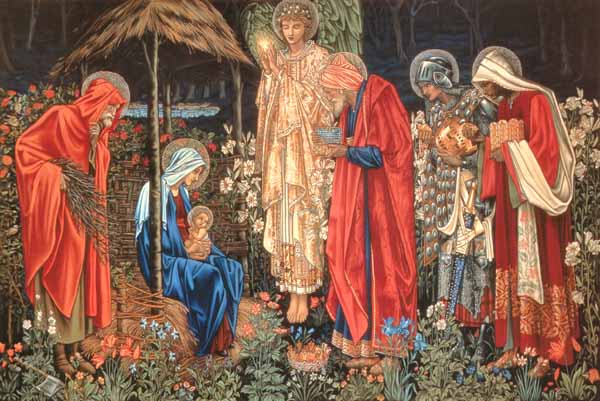
This is Burne-Jones’ “Star of Bethlehem”. I got the pattern finished and went looking for the date it was painted, and discovered that his first version of this was a tapestry design for the William Morris Company. He was later given a commission to do a painting and in it he reworked the colors and put in a lot of detail you couldn’t have in a tapestry. Here’s the tapestry:

This one is called “Adoration of the Magi”. I know which one I like better! >sigh< Partly the tapestry has a more reasonable level of detail, and partly I like the colors better. So much of Burne-Jones’ work is in these murky blues and greens that make me feel like something has happened to my vision. (Nothing wrong with blue and green — I just like red better.) So I have started over on a pattern of the tapestry. I’ll release the other pattern too, since it’s finished, but I want to put them out at the same time because I don’t want anyone to buy one pattern and then wish they had the other. (By the way, these are not pattern images — these are the retouched art I worked from.) Kind of interesting to compare, don’t you think?


From Divecat
14 years, 5 months agoWow, my vote is for the second (red) one too!
From Sharon
14 years, 5 months agoI like the red one since it shows up better and feels more Christmas-y.
From Rifestitch
14 years, 5 months agoYep, I like the tapestry version better, too. I wonder why such the departure in color for the painting? If the tapestry worked well enough to get the painting commission…?
The design for the tapestry didn’t include colors. William Morris chose the colors for it. I think Burne-Jones just liked what to me are dreary colors.
From Suzanne
14 years, 5 months agoThese are both beautiful! I love the glistening angel from the tapestry, but I personally like the blues and greens in the painting. I want this one!