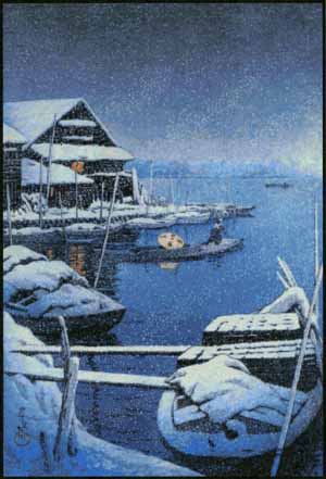
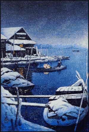
We’ve upgraded our cover stock. Until recently, we were using 60 pound card stock (which has a matte finish). We are now using 69 pound glossy paper, which we think is a big improvement. The colors are more vibrant and saturated, and while I don’t believe that the card stock actually showed less detail, it didn’t show up as clearly. We had always assumed that if the printer has a setting for card stock, and you PICK the setting for card stock, the printer will use the perfect amount of ink for card stock, but apparently not. Or maybe there is no perfect amount. When we tried glossy paper, we were really astonished at the difference. Here are a couple of examples to give you an idea.


We hope you’ll like this change!


From dot
9 years, 11 months agoYou are so right the new paper looks so much clearer and crisp,Im not sure how other stitchers use the patterns but for me I refer to the picture numerous times for reference. and to see if I have the right colors where they are suppose to be……thanks for the change.
From Barb Rhoades
9 years, 11 months agoWhile it is difficult to tell without the actual covers – I think I prefer the old stock. The shading appears to be more distinct on the old vs the new! Yes, the picture is sharper, but the shading is less apparent and thus of less use on the new. Thanks for the chance to comment.
Much of that is due to my scanner.
From Christina Busby
9 years, 11 months agoLooks great! More detail apparent in the glossy paper used. And yes, I do refer to the picture constantly when I am stitching to compare my work with the actual picture! Thank you.
I like to work from a printout of the picture with the grid superimposed. This can usually be sized to fill most of a sheet, and I am now recommending that people use glossy paper for this as well.