We’ve recently added a couple of charts for pictures in black-and-white (or more accurately, gray-scale). They appear to be black and white but they use upwards of 20 colors (black, white, and shades of gray). The Burne-Jones woodcut, “Souls being Received into the Heavenly Paradise”, in particular, doesn’t seem to have a lot of subtle shading (especially compared to “All is Vanity” which was a charcoal drawing), so the question arose, how would this look as blackwork (stitching entirely in black and leaving the white areas unstitched)?
Traditional blackwork deals mostly in silhouettes, geometric areas, or fancy fills. It’s not impossible to have a detailed representation of a face or a flower, but it has to be big enough so that the detail can really be spelled out. Our version of the woodcut cheats, in a way, by using shadings to suggest detail that isn’t really there.
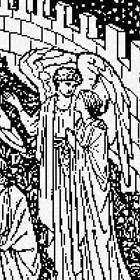
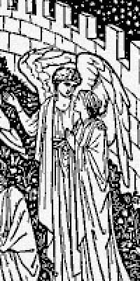
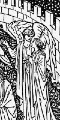
Here is a section of our pattern in three versions: 2 colors (black and white only, left), 4 colors (black, white, light and dark gray, center), and the pattern we actually published (23 colors, right).


You can see that the 2-color version is very blocky, and some elements are completely missing (compare the stars in the upper right to the other versions). The 4-color version is much better, but curves are still blocky — look at the wall, and the angel’s wings. (Try getting back from the screen for comparing the pictures.) In the 23-color version, the curves are much smoother, and the girl’s hair suggests actual strands instead of just being a jumble of various shades. It’s hard to tell from this small sample, but the plants around the figures have a lot more detail in the 23-color version. In the 4-color version, the plants in many areas degenerate into gray patches and you can’t actually make out stems, leaves, etc.
But isn’t 23 colors overkill? If 4 isn’t quite enough for good detail, how about 6 or 8? Surprisingly, no 2 of the 23 colors are close to each other — that is, if you laid out all the colors, they would all be easy to tell apart. That’s an indication that all of the colors are important for the level of detail.


From Sharon
long agoThis certainly shows what a science the patterns are. Quite interesting!
From Alanna
long agoWow, thanks for explaining that, Meredith! I find it really fascinating to see how the pattern making (and colour correction) processes work. I’d really love to learn all about it, maybe you want an apprentice pattern maker from Australia to come and do an internship with you??? 😉